Lanex Corporation Rebrand
From Logo to Brand System
Introduction
My journey with Lanex Corporation
What if your brand’s best work isn’t being seen—simply because the logo disappears in print and looks inconsistent online? That’s the gap I set out to close.
I worked at Lanex Corporation from May 2021 to November 2024—starting as a Project Manager and UX Designer (first 10 months), then shifting into Business Development Manager (Feb 2022–Nov 2024), with an additional role as Design Operations Lead and Creative Team Manager. Those blended roles—strategy, ops, design—positioned me to lead a focused rebrand that improved visibility and consistency.
Why a Rebrand Was Needed
Spotting the gaps in brand identity
Across touchpoints, the logo lacked clarity at small sizes and on various backgrounds. Teams also needed a single source of truth for usage. We weren’t telling the same visual story everywhere, which weakened recall with prospects and partners.
My Focus in the Rebranding Project
Building a stronger, consistent brand
My rebrand objectives were simple and measurable: improve visibility, unify execution, and speed up production. Workstreams included:
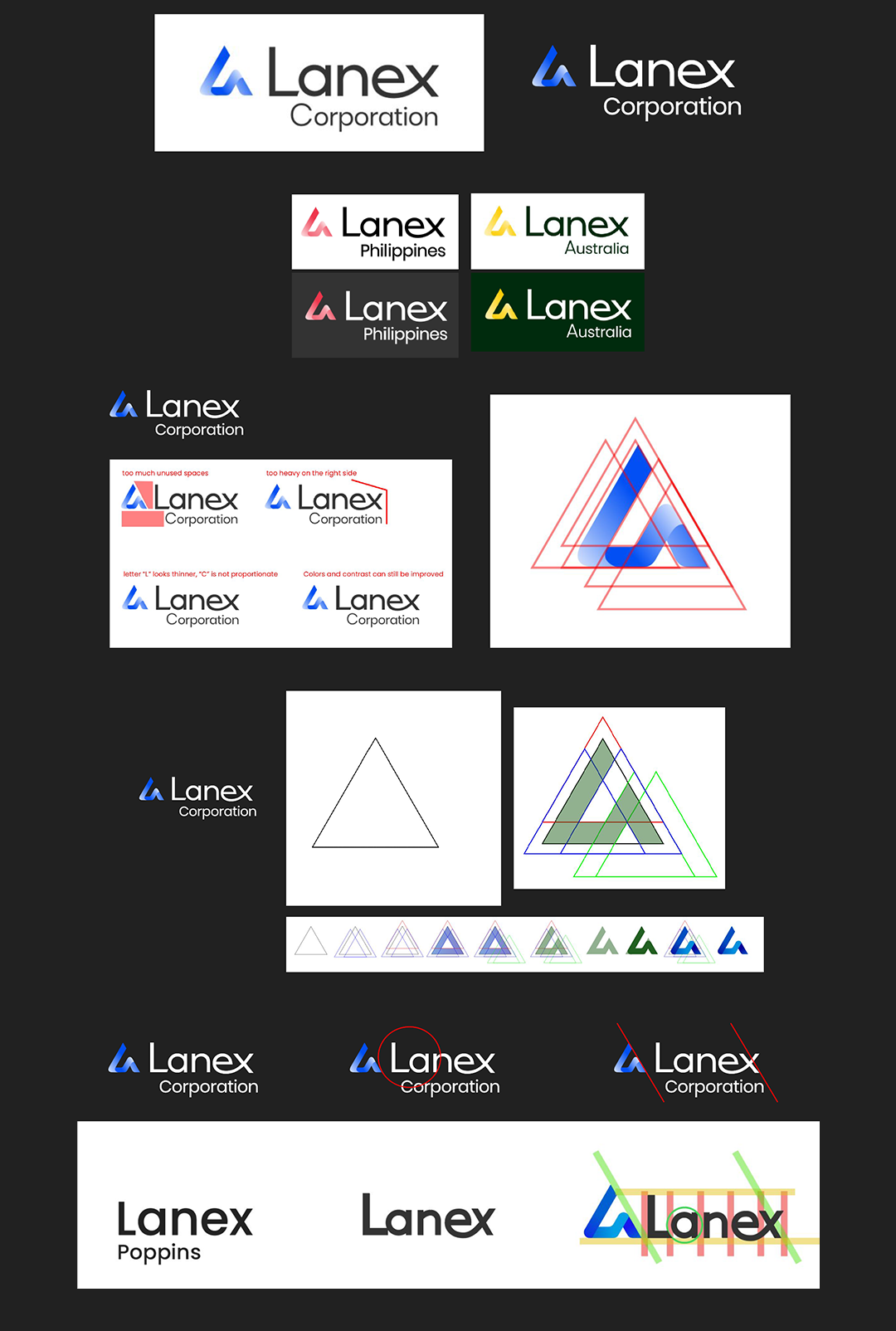
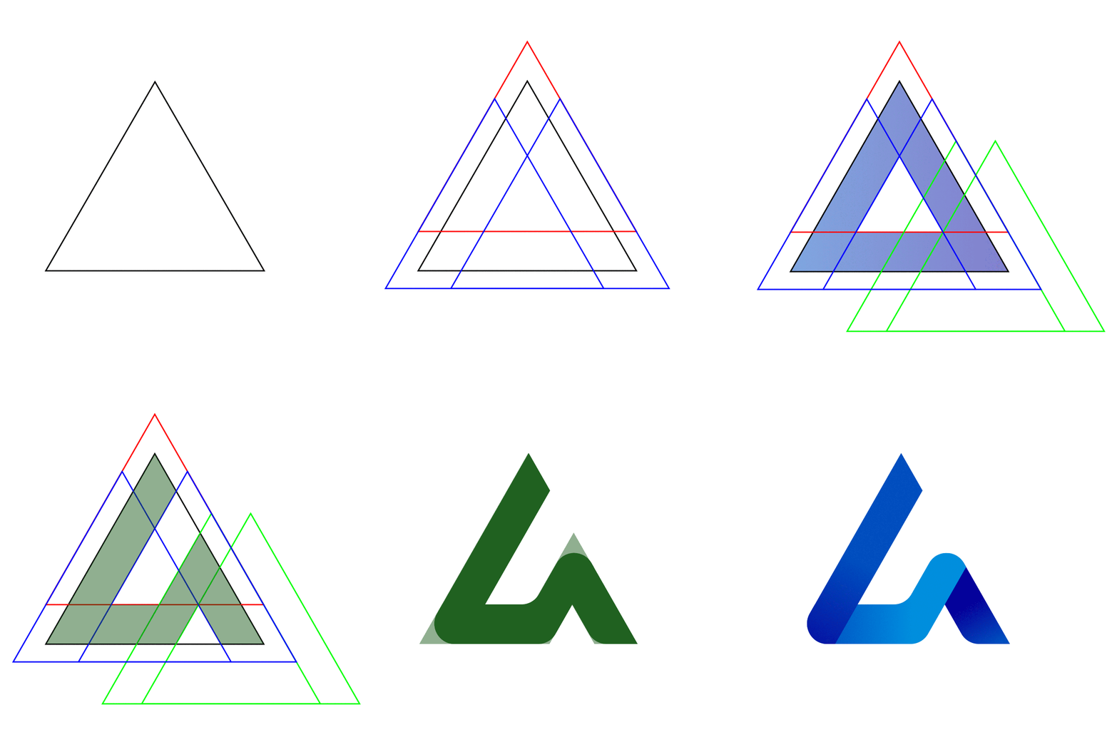
- Logo refinement for legibility
-
Cleaned up emblem–wordmark lockups; ensured scalable, crisp use in print, web, and merchandise.
-
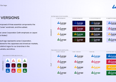
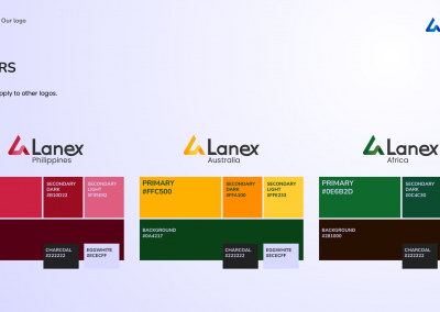
Prepared versions for Corporation plus Philippines, Australia, and Africa lockups.
-
- A complete brand book
-
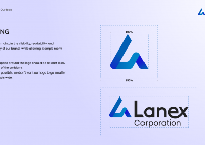
Logo anatomy & spacing rules for breathing room and minimum sizing.
-
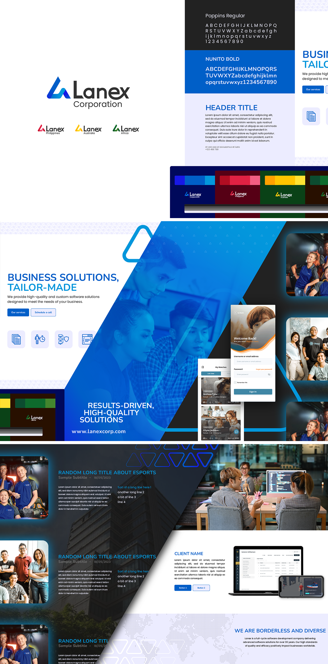
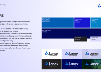
Color system using a primary hue, dark/light secondaries, plus charcoal and eggwhite for contrast and accessibility.
-
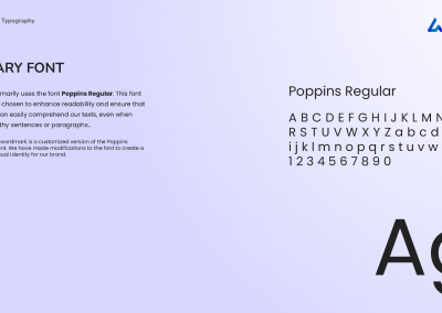
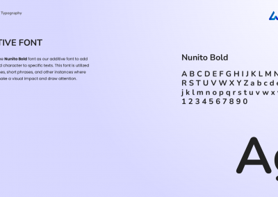
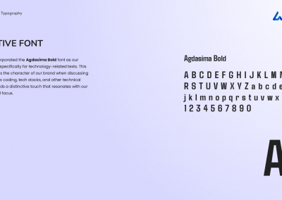
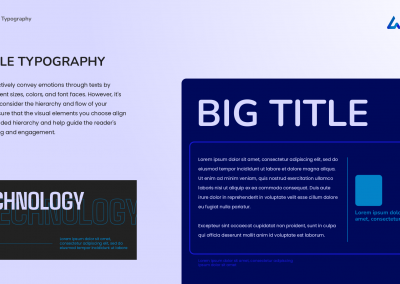
Typography stack with Poppins for body, Nunito for emphasis, and Agdasima for tech contexts.
-
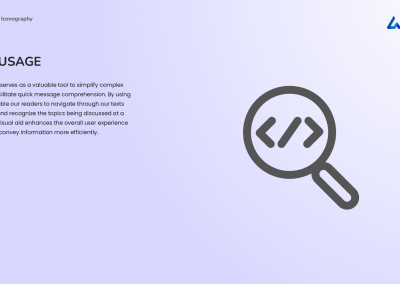
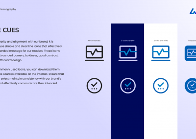
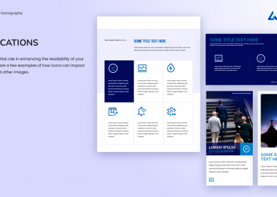
Iconography guidelines (simple line icons; rounded, high-contrast).
-
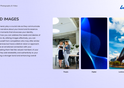
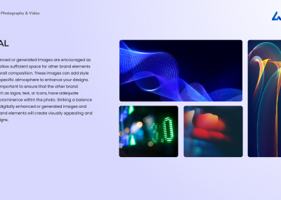
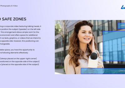
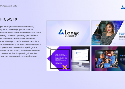
Photography & video direction (authentic people shots, digital/landscape guidance, on-screen safe zones, tasteful motion/SFX).
-
- Stylescape to set the visual roadmap
- Aligned teams on the look/feel—colors, type, image style—so every asset landed on-brand.
- Assets & merchandise
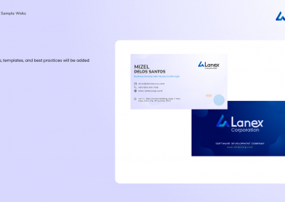
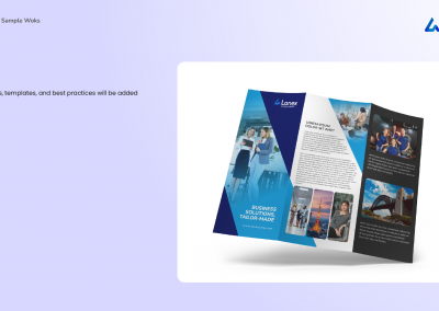
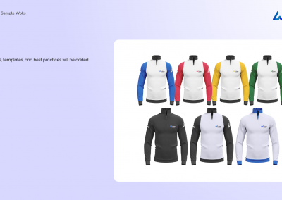
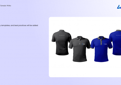
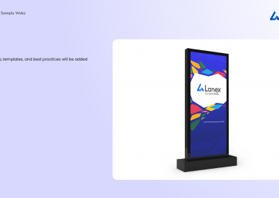
- Reusable templates, layouts, and branded items to keep execution fast and consistent.
The Visual Journey
From concept to guidelines
This project is best understood visually. The progression—from stylescape to final lockups, then into a robust brand guidelines document—gave Lanex a modern, versatile system that reads clearly in small UI elements, scales to signage, and stays consistent in decks, social, and video.
Looking Back
What the rebrand means to me
The outcome is more than a cleaner logo—it’s a system that strengthens brand recognition and speeds up delivery for campaigns, proposals, and content. It’s where my BD, ops, and design leadership converged to help Lanex show up the same way, everywhere.
